
Colour theory Research
- Imogen Latto
- Dec 6, 2017
- 3 min read
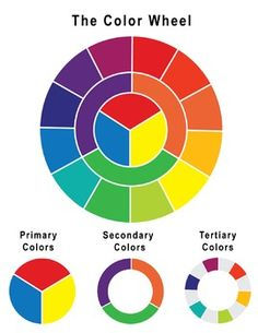
The colour theory is used to create a logical order of colour. For example if you had an assortment of sweets you can place them into their coloured catogries. There are three catergories that the different colours are put into.
Primary Colours: Are the three pigment colors that cannot be mixed or formed by any combination of other colors. (Red,Yellow and Blue)
Secondary Colours: These are the colours formed by mixing primary colours. (Green, Organge and Purple)
Tertitary Colours: These are the colors formed by mixing a primary and a secondary color. (Blue-Green, Red-Violet and Yellow-Orange)
https://www.colormatters.com/color-and-design/basic-color-theory
In photography colors can be used to set a mood, attract attention or make a statement. By selecting the right color scheme you can create an ambiance of elegance, warmth or tranquility. I feel like different colours convey different moods and add to the viewers atmosphere. I am considering using subtle colour in some of my imagery becuase I want the photographs to create a realistic mood that the viewer can relate to.
http://www.tigercolor.com/color-lab/color-theory/color-theory-intro.htm
Do different colours effect your mood?
I have considered to use some colours on my photographs to create a vivid and realistic atmosphere.
Red: Red can stimulate a faster heartbeat and breathing paste. Red can be seen as an extreme color and can make people more aware of what the subject is in a photograph. Also this colour can be identified to some people as danger, which could link strongly to my murder mystery narrative.
Blue: Blue causes the opposite reaction as red. For example it can create a peaceful and tranquil atmosphere for the viewer. However, blue can also be cold and depressing. I think that if i was to use the colour blue it would work well because it would be the complete opposit to my narrative.
Purple: Purple could suggest royalty, luxury, wealth and sophistication. This colour could work well in my project because it could be used to convey one of the characters.
https://www.infoplease.com/color-psychology
I have choose to research into different colours that can change moods becuase I would like this to happen on my photographs e.g. a cold colour ontop of an image can create a peaceful and tranquile mood for the viewer.
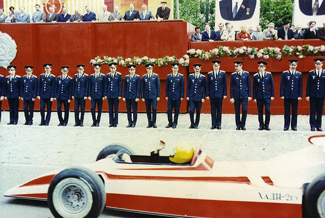
Boris Mikhailov
Boris Milhailov is a photographer who has been described as "one of the most important artists". His project that has inspired me to research into the colour theory is 'Red', this is where he has photographed multiple things together that contain the colour red.
'Red' is a group of 84 colour photographs taken between 1968 and 1975 in Mikhailov’s home town of Kharkiv in Ukraine. He has captured a variety of subjects e.g. scenes from official military parades, views of the Kharkiv cityscape, and private moments between family and friends. The snapshots do not document significant events, but they just show the everyday life events that covey similar colours. The art historian Urs Stahel has observed how Mikhailov traces every speck of red in the Ukrainian landscape and visualises the saturation and thorough coloration of the social body’.
The colour red is always easily identifiable and can be spotted on many objects throughout the daily life. Red finds its way into the private life of the home, in wallpaper, curtains and flowers. In some images only the tiniest specks of red are noticed e.g. a pin or a painted toenail. Red can even be seen on the human body .e.g bruises or sunburnt flesh.
Overall I feel like the red colour creates quite a disorganised picture and creates vivid focal point for the viewer.
http://www.tate.org.uk/art/artworks/mikhailov-red-t13358


Comments