
Exploration of photoshop for end user context
- Imogen Latto
- Apr 18, 2018
- 1 min read
I have decided to edit some of my images that I am using for my end user context because I feel that they need to be slightly adjusted. Some of the elements I have decided to adjust include, saturation and brightness. These elements should be perfect because I want to display the same colour palette throughout my photobook, which should convey a soft delicate atmosphere of the B&B.
To edit this image I cropped it slightly to get rid of the white boarder in the right corner. I thought that this ruined it and without it the image on the wall would be the main focal point for the audience.
Before

After - I just used the crop tool on photoshop.

I chose to edit this image and adjust the saturation of the orange light. I did this because the colour palette of this image is very warm toned and all my other images are very cool toned, conveying a gentle atmophere. After editing the saturation I feel that the cool toned colour pallette can be maintain the same throughout my photobook.
Before
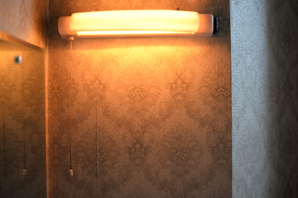
After- 'Image, adustment, Hue/Sturation'

I only sightly edited this image because I felt that the top right hand corner was quite bright, due to the natural sunlight. Therefore I chose to bring the brightness slightly down, which I think now works well to vividly show the staircase. I believe that now after turning down the brightness, the colour range of the image will fit in perfectly with the other images in my photobok.
Before

After- 'Image, Adjustments, Brightness/Constrast'


Comments